Push Notifications: an Effective and Frugal Marketing Strategy
By Pallavi Gangwar · 4 Jun 2021

Try to recall a day in the recent past when you did not check your mobile phone. You can’t, right! Like it or not, mobile phones have become an integral part of our lives. Whenever our little beloved device rings, we rush to check it: hoping that it is from someone important. And how many times have you been disappointed discovering that the ring was just the sound of a push notification trying to sell you some stuff you did not even want in the first place? Be honest: it happens more often than not. But what if that same push notification brings a genuine smile on your face, giving you a moment to flee from your hectic schedule, even if the moment is minuscule?
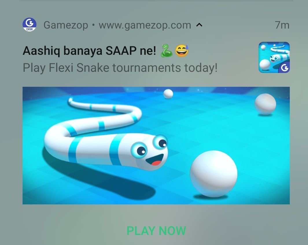
That was the question that we, at Gamezop, were trying to answer when we mooted the idea of starting sending Push Notifications to our users. With millions of users playing our games every month, staying connected with them was a challenge for us. Moreover, as a company that believes in keeping a frugal culture, our first answer was not to start pushing our marketing budgets. Unsurprisingly, Push Notifications seemed the right strategy to fulfill our goals. It was better than sending SMS which, let’s admit it, is only good for sending OTPs.
Push Notifications can have images, icons, and buttons that cannot be added in a simple SMS. Sending emails or SMS also requires Personally Identifiable Information (PII) of users such as phone numbers or email addresses, which not all users may be willing to share. Not only that: there’s also a cost associated with sending each email or SMS (the fee you pay to your service vendor). And finally, we all know how poor the click-through rates are when it comes to email or SMS communication (we’re talking under 1% numbers). All in all, these were ruled out as expensive, ineffective solutions.
At Gamezop, we have worked hard on building a Progressive Web App (PWA): a website that can be saved as an app on your phone and behaves just like an app: without the friction of an app install. A PWA can send notifications, work offline, exist as an app on your phone, and more! With all this cutting edge tech in place, we decided it’s best to channelize our energies towards one thing and do it well. The buck stopped at the digital Holy Grail that is Push Notifications!
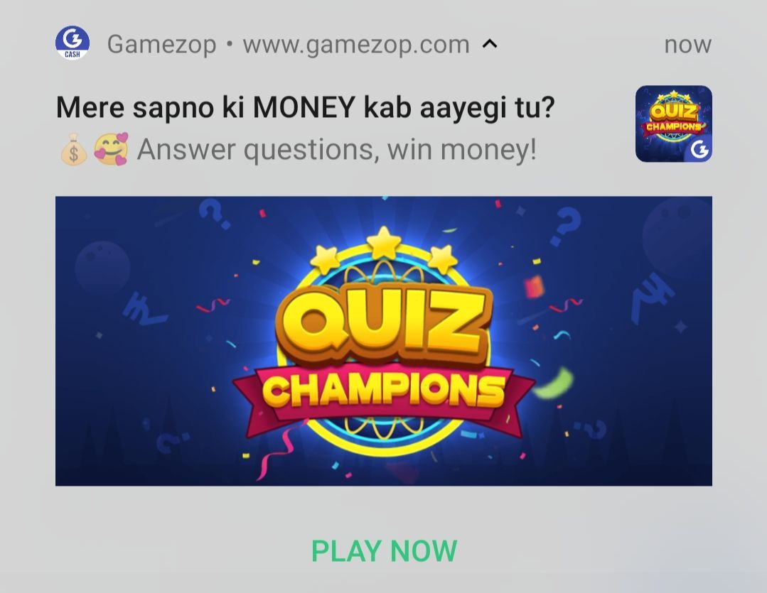
But, wait a minute! All was not that well. There were still some challenges that needed to be resolved before we finalized our push notification strategy. The biggest one, we knew, was going to be capturing the users’ attention within that one-second glance you make at the screen after it beeps and before turning it back off, annoyed at yet another sale offer. It’s quite tricky, as the line between being informative/engaging and being downright annoying is quite a thin one. We clearly understood that if we went overboard, it can cause users to mute or turn off our notifications. Furthermore, Push Notifications have a specific character limit and thus pose a challenge to convey the message in the shortest possible manner.
Our target to stay connected with our users and increase the click-through rate loomed on the horizon like a daunting task. But we as a team agreed on the following few points that were utmost necessary to make users like our Push Notifications:
- Content is King: In January 1996, Bill Gates famously proclaimed that ‘Content is King’. Two decades later, this still holds. Thus we also agreed that the content should be such that users can relate to it. We decided to make puns on a mixture of Hindi movies, songs, and catchphrases. We hypothesized that people will relate to the quirky notifications and might enjoy the content.
- Value-driven proposition: Notifications should have immediate value. Getting discounts and free stuff that can be redeemed at that very instant may help increase the click rate. Thus, we decided to make notifications for various contests that we run on our portal where users can participate, play, and win money.
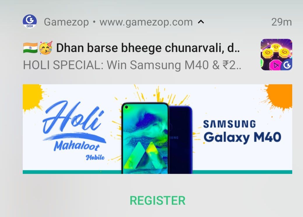
- Frequency of notifications: Sending too many notifications can be so annoying that it might cause people to stop using the app altogether. Thus, we agreed to send one notification per day.
- Timing of sending the notifications: The timing of the notification is decided by the nature of the app itself. A fitness app’s notification will be best appreciated by the users either in the morning or in the evening. As a casual gaming company, we identified the time when most of us want a break from the day’s hectic schedule: afternoon and late evenings just before the work-day ends – we decided to alternate between these two time slots.
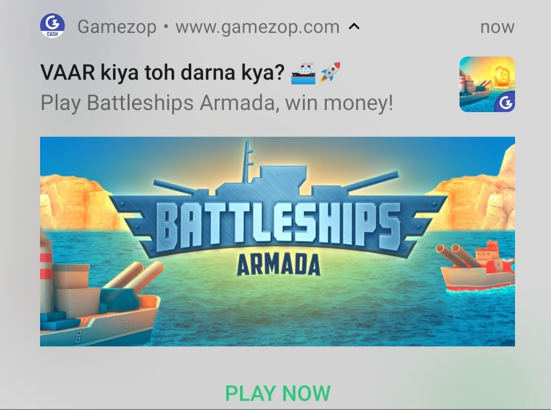
- Length of notifications: No one wants a thesis in a notification. The shorter, the easier to read. As a rule of thumb, the length of our notification title rarely ever exceeds 5 words.
- Using colorful and attractive emojis: Use of emojis in the content increases its visibility. Moreover, emojis triggers emotions in the human mind which further boosts the click-through rate. Therefore, we ensure we include emojis in our Push Notifications ?
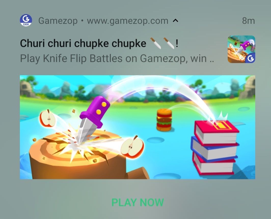
Ever since we went live with these notifications, we have seen a much better reception of our notifications among users. The overall click-through rate also saw a significant jump. We plan to continue delighting our users with such exciting notifications. In this journey to make our users smile, we will try to incorporate new learnings and experiences.
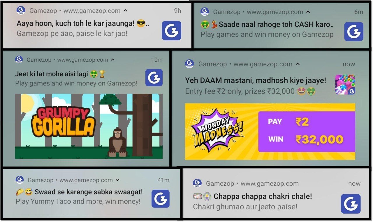
We can't wait to see what you'll do with our games